4 Week 13: The linear model
Written by Margriet Groen (partly adapted from materials developed by the PsyTeachR team a the University of Glasgow)
This week we will focus on the linear model and simple linear regression.
4.1 Lectures
The lecture material for this week is presented in two parts:
How to build a linear model in R (~30 min) You can find the example script in this week’s zip-folder (see under Pre-lab activity 3).
4.2 Reading
The reading that accompanies the lectures this week is from chapter 10 of the core text by Howell (2017). Please note that I mention an alternative textbook in the lectures. The content is highly similar, but this year, we’ve decided to use Howell (2017) as the core text for PSYC121 and PSYC122. So no need to look at the book by Miller and Haden.
4.3 Pre-lab activities
After having watched the lectures and read the textbook chapter you’ll be in a good position to try these activities. Completing them before you attend your lab session will help you to consolidate your learning and help move through the lab activities more smoothly.
4.3.1 Pre-lab activity 1: Visualising the regression line
Have a look at this visualisation of the regression line by Ryan Safner.
In this shiny app, you see a randomly-generated set of data points (within specific parameters, to keep the graph scaled properly). You can choose a slope and intercept for the regression line by using the sliders. The graph also displays the residuals as dashed red lines. Moving the slope or the intercept too much causes the generated line to create much larger residuals. The shiny app also calculates the sum of squared errors (SSE) and the standard error of the regression (SER), which calculates the average size of the error (the red numbers). These numbers reflect how well the regression line fits the data, but you don’t need to worry about those for now.
In the app he uses the equation Y = aX + b in which b is the intercept and a is the slope.
This is slightly different from the equation you saw during the lecture. There we talked about Y = b0 + b1*X + e. Same equation, just different letters. So b0 in the lecture is equivalent to b in the app and b1 in the lecture is equivalent to a in the app.
Pre-lab activity questions:
- Change the slider for the intercept. How does it change the regression line?
- Change the slider for the slope. How does it change the regression line?
- What happens to the residuals (the red dashed lines) when you change the slope and the intercept of the regression line?
4.3.2 Pre-lab activity 2: Data visualisation - practice with ggplot2()
In this week’s online tutorials, you will practise visualing data.
If you’re ready to begin, go to the tutorial linked to below. There is no need to install or download anything. Each tutorial has everything you need to write and run R code, right in the tutorial.
Visualisation basics Practise the basics of how to create a graph, how to add variables and how to make different types of graphs.
Scatterplots This tutorial revisits scatterplots. Along the way, you will learn to build multi-layer plots and to use new coordinate systems.
4.3.3 Pre-lab activity 3: Getting ready for the lab class
4.3.3.1 Get your files ready
Download the 122_week13_forStudents.zip file and upload it into the new folder in RStudio Server you created.
4.4 Lab activities
In this lab, you’ll gain understanding of and practice with:
- conducting simple regression in R
- interpreting simple regression in R
- reporting the results in APA format
- when and why to apply simple regression to answer questions in psychological science
4.4.1 Lab activity 1: The regression line
4.4.1.1 Question 1
What is the regression equation as discussed during the lecture and what does each letter represent?
4.4.1.3 Question 3
Discuss the answers to the pre-lab activity questions. What did you find?
Change the slider for the intercept. How does it change the regression line? The value for y at x = 0 changes.
Change the slider for the slope. How does it change the regression line? The steepness of the line changes.
What happens to the residuals (the red dashed lines) when you change the slope and the intercept of the regression line? The distance between the fitted values (the line) and the observed values (the dots) increases. Therefore, the red dashed lines become longer suggesting that the residuals increase. The model therefore fits the data less well.
4.4.2 Lab activity 2: Statistics anxiety and engagement in module activities
In this lab, we’ll be working with real data and using regression to explore the question of whether there is a relationship between statistics anxiety and engagement in course activities. You’ll need the data files psess.csv and stars2.csv and the R-script 122_wk13_labAct2_template.R that you downloaded when completing Pre-lab activity 3.
4.4.2.1 Background
The hypothesis is that students who are more anxious about statistics are less likely to engage in course-related activities. This avoidance behaviour could ultimately be responsible for lower performance for these students (although we won’t be examining the assessment scores in this activity).
We are going to analyse data from the STARS Statistics Anxiety Survey, which was administered to students in the third-year statistics course in Psychology at the University of Glasgow. All the responses have been anonymised by associating the responses for each student with an arbitrary ID number (integer).
The STARS survey (Cruise, Cash, & Bolton, 1985) is a 51-item questionnaire, with each response on a 1 to 5 scale, with higher numbers indicating greater anxiety.
Cruise, R. J., Cash, R. W., & Bolton, D. L. (1985). Development and validation of an instrument to measure statistical anxiety. Proceedings of the American Statistical Association, Section on Statistical Education, Las Vegas, NV.
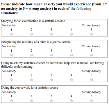
Example items from the STARS survey
As a measure of engagement in the course, we will use data from Moodle usage analytics. Over the course of the term, there were eight optional weekly on-line sessions that students could attend for extra support. The variable n_weeks in the psess.csv file tells you how many (out of eight) a given student attended.
Our hypothesis was that greater anxiety would be reflected in lower engagement. Answer the following question.
QUESTION 1:
If our hypothesis is correct, what type of correlation (if any) should we observe between students’ mean anxiety levels and the variable n_weeks?
Before we do anything else, let’s load the libraries that we need for this analysis.
TASK: Load
broom,carandtidyverse. HINT: Uselibrary().
TASK: Read in both files, have a look at the layout of the data and familiarise yourself with it. HINTYou can use the
read_csv()and thehead()function.
QUESTION 2
In the stars table, what do the numbers in the first row across the three columns refer to?
Now that we’ve read in both data files, the next step is to calculate the mean anxiety scores for each participant. At the moment we have scores on all questions separately for each participant in the stars table. Instead we need one mean anxiety score for each participant.
TASK: Write the code to calculate mean anxiety scores. Remember that participant is identified by the
IDvariable. Store the resulting table in a variable namedstars_mean. HINT: Usegroup_by()andsummarise(). Also, remember to usena.rm = TRUEwhen calculating the mean scores to deal with participants who have missing data (NAs).
QUESTION 3 What is the mean anxiety score for participant 3?
Ok, before we get ahead of ourselves, in order to perform the regression analysis we need to combine the data from stars (the mean anxiety scores) with the data from engage (n_weeks).
TASK: Join the two tables, call the resulting table
joined. HINT: Use theinner_join()function (making use of the variable that is common across both tables) to join.
We now need descriptive statistics for both variables.
TASK: Calculate the mean and standard deviations for the anxiety scores and the engagement data.
QUESTION 4 What are the means and standard deviation for anxiety and engagement with the statistics module?
As always, it is a good idea to visualise your data.Now that we have all the variables in one place, make a scatterplot of anxiety as a function of engagement.
TASK: Write the code to create the scatterplot. HINT: For this you’ll need the
ggplot()function together withgeom_point()andgeom_smooth(). Make sure to give your axes some sensible labels with thelabs()function.
QUESTION 5 What does the scatterplot suggest about the relationship between anxiety and engagement?
With all the variables in place, we’re ready now to start building the regression model.
TASK: Use the
lm()function to run the regression model when you model engagement (the outcome variable) as a function of anxiety (the predictor variable) and use thesummary()function to look at the output. HINT:lm(outcome ~ predictor, data = my_data).
QUESTION 6 What is the estimate of the y-intercept for the model, rounded to three decimal places?
QUESTION 7
To three decimal places, if the General Linear Model for this model is Y=beta0 + beta1X + e, then beta1 is …
QUESTION 8 To three decimal places, for each unit increase in anxiety, engagement decreases by …
QUESTION 9 To two decimal places, what is the overall F-ratio of the model?
QUESTION 10 Is the overall model significant?
QUESTION 11 What proportion of the variance does the model explain?
Now that we’ve fitted a model, let’s check whether the model meets the assumptions of linearity, normality and homoscedasticity.
TASK: Write the code to check the assumptions. HINT:
crPlots()to check linearity,qqPlot()to check normality of the residuals, andresidualPlot()to check homoscedasticity of the residuals.
QUESTION 12 Does the relationship appear to be linear?
QUESTION 13 Do the residuals show normality?
QUESTION 14 Do the residuals show homoscedasticity?
Finally, it’s time to write up the results following APA guidelines.
QUESTION 15 What would the results section look like if you wrote them up, following APA guidelines? HINT: The Purdue writing lab website is helpful for guidance on punctuating statistics.
4.5 Answers
When you have completed all of the lab content, you may want to check your answers with our completed version of the script for this week. Remember, looking at this script (studying/revising it) does not replace the process of working through the lab activities, trying them out for yourself, getting stuck, asking questions, finding solutions, adding your own comments, etc. Actively engaging with the material is the way to learn these analysis skills, not by looking at someone else’s completed code…
4.5.1 Lab activity 1
What is the regression equation as discussed during the lecture and what does each letter represent? Y = b0 + b1 * X + e Y = outcome variable b0 = intercept b1 = slope X = predictor variable e = error
What are residuals? Residuals reflect the discrepancy between the observed values and the fitted values and give an indication of how well the model ‘fits’ the data.
Discuss the answers to the pre-lab activity questions. What did you find?
- Change the slider for the intercept. How does it change the regression line? The value for y at x = 0 changes.
- Change the slider for the slope. How does it change the regression line? The steepness of the line changes.
- What happens to the residuals (the red dashed lines) when you change the slope and the intercept of the regression line? The distance between the fitted values (the line) and the observed values (the dots) increases. Therefore, the red dashed lines become longer suggesting that the residuals increase. The model therefore fits the data less well.
4.5.2 Lab activity 2
You can download the R-script that contains the code to complete lab activity 2 here: 122_wk13_labAct2.R.
If our hypothesis is correct, what type of correlation (if any) should we observe between students’ mean anxiety levels and the variable
n_weeks? A negative correlationIn the
starstable, what do the numbers in the first row across the three columns refer to? ID = 3, Question = Q01 and Score = 1 shows us that participant 3 reported a score of 1 on question 1.What is the mean anxiety score for participant 3? 1.058824
What are the means and standard deviation for anxiety and engagement with the statistics module? Anxiety M = 2.08, SD = 0.56; Engagement M = 4.54, SD = 2.42.
What does the scatterplot suggest about the relationship between anxiety and engagement? That there might indeed be a relatively strong negative correlation between the two; students with more anxiety, engage less.
What is the estimate of the y-intercept for the model, rounded to three decimal places? 9.057. Explanation: In the summary table, this is the estimate of the intercept.
To three decimal places, if the General Linear Model for this model is
Y=beta0 + beta1X + e, thenbeta1is … -2.173. Explanation: In the summary table, this is the estimate of mean_anxiety, i.e., the slope.To three decimal places, for each unit increase in anxiety, engagement decreases by … 2.173. Explanation: In the summary table, this is also the estimate of mean_anxiety, the slope is how much it decreases so you just remove the - sign.
To two decimal places, what is the overall F-ratio of the model? 11.99. Explanation: In the summary table, the F-ratio is noted as the F-statistic.
Is the overall model significant? Yes. Explanation: The overall model p-value is .001428 which is less than .05, therefore significant.
What proportion of the variance does the model explain? 25.52%. Explanation: The variance explained is determined by R-squared, you simply multiple it by 100 to get the percent.
Does the relationship appear to be linear? Yes, the pink link roughly falls across the dashed blue line and looks mostly linear.
Do the residuals show normality? Yes, in the qq-plot the open circles mostly assemble around the solid blue line, and fall mostly within the range of the dashed blue lines.
Do the residuals show homoscedasticity? Yes, the residual plot shows that the spread of the residuals is roughly similar for different fitted values.
What would the results section look like if you wrote them up, following APA guidelines? A simple linear regression was performed with engagement (M = 4.54, SD = 0.56) as the outcome variable and statistics anxiety (M = 2.08, SD = 0.56) as the predictor variable. The results of the regression indicated that the model significantly predicted course engagement (F(1, 35) = 11.99, p < .001, R^2 = 0.25), accounting for 25% of the variance. Anxiety was a significant negative predictor (beta = -2.17, p < 0.001): as anxiety increased, course engagement decreased.